Saturday, December 14, 2013

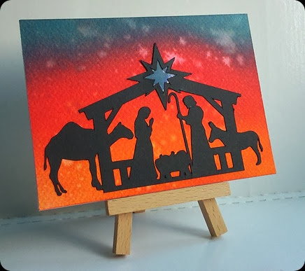
Holy Night

DSC_3040
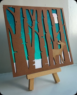
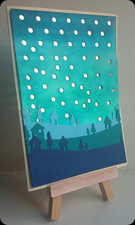
I am by no means religious, but u cant beat a bit of tradition at Christmas. This is a Silhouette Studio file I’ve had since last year and as I was messing about with the ink and water technique, it seemed fitting.
Wednesday, December 11, 2013

Forest For The Trees

DSC_3044
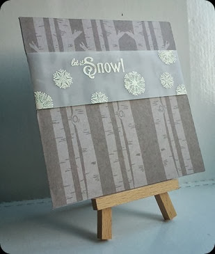
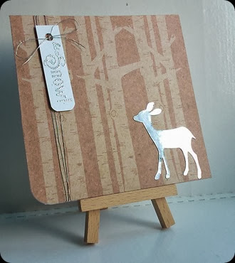
I don't know what it is about birch trees – the symmetry perhaps? But they make a great motif – for all seasons, really.
DSC_3039
But particularly for winter/Christmas. I recoloured the tree image to make it more kraft and then with a bit of sepia to see which one printed out the best – turns out I liked em both!
DSC_3046
And then I tried a similar design with Robocop. The sky is inked with a mixture of inks and sprinkled with water, a technique I’ve seen a lot just lately and the snow is just torn printer paper.

Saturday, December 07, 2013

Merry Little Christmas

WoodlandWreath_3
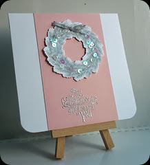
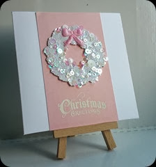
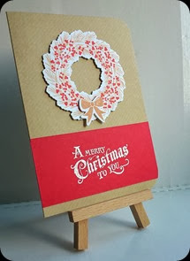
Still not finished with my WPlus9 set, these layouts are based on a design I saw…somewhere. I think its really classy! The sentiment is computer generated.
WoodlandWreath_5

Wednesday, December 04, 2013

Woodland Wreaths

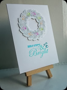
W Plus 9 have some truly beautiful sets of stamps and some with coordinating dies. Unfortunately they’re in the ol’ US so when I caved and ordered their wonderful Woodland Wreaths set, I was landed with a customs charge – no actually, I was landed with a VAT charge and an EIGHT POUND handling fee!  - which was rather annoying… but the set is still gorgeous:
DSC_3041 DSC_3042
DSC_3047 DSC_3050

I have found out there is a stockist of WPlus9 in the UK tho, although they obviously don't get them straight away and patience was never a virtue of mine but they have a pretty ace selection – in fact I want to buy it all!! Visit http://www.makethedayspecial.co.uk/ to see for yourself…

Saturday, November 30, 2013

Negative Thinking

Hello internet, its been a while…

Just in case you were wondering, I haven’t been completely idle these last few months, just spending more time away from my desk than at it. But I have been creating, mostly Christmas cards, which I’ll share with you in the coming weeks.

It seems deer are a big trend again this year, from furnishings to wrappings and, of course, paper crafting. There are a fair few stamps and dies out there featuring these cute/majestic creatures. I created this stag head in Silhouette studio:

DSC_3034

And teamed it with a bit of wood grain digi paper which I recoloured in Photoshop and found that the frame from my bargain £2 stamp set from the NEC was just the right size!

I also used the negative space:

DSC_3043

Running the panel through an embossing folder and again pairing it up with the wood grain paper. I think an argument could be put forward for these to be quite masculine cards but I would love to receive them too, so… maybe that says more about me?
Thursday, September 26, 2013

Falling Skies

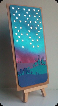
DSC_0053 I think I got a little carried away with the falling backgrounds, I ended up cutting quite a few! I do like the colour combination on this tho! I think I need more practice with the blending but I still think its fairly realistic.

I tried to mimic the sky colours with the cardstock skyline and I’m pleased with how that came out too:


This other one was intended to be snow, rather than stars, but if I do it again, I’ll make the dots a lot smaller!

DSC_0056

Monday, September 23, 2013

Golden Years

DSC_2878 My parents went to a Golden Anniversary party recently and requested a card. I had seen a couple of cards on Pinterest and the blogs I read with this angled “topper” layout.

In hindsight, Im not sure I like the angle of white panel, it kind of slipped from its original placement.. but then it shows more of the gold backing card that way, so maybe it can be excused. The tree is a memory box die cut into double sided adhesive paper and covered with gilding flakes. The birds are an old SU stamp and I printed the banner and fussy cut it from vellum.

Wednesday, September 18, 2013

Starry Square-y Night

Before I went the circle route, I tried cutting a Robocop panel with “falling stars”… it is SO hard to make something look random!!

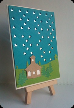
The Memory Box village die got a lot of use during this particular week, mainly cos I convinced my mom to buy some Marianne Christmas Village dies to make her cards with this year… so naturally I had to have a play with them, right? Is this a church or a schoolhouse? Not really sure - u'll see it again tho!

Again no sentiment – its too early!
DSC_0048

Monday, September 16, 2013

Starry Starry Night

DSC_0051
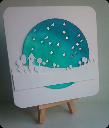
I came across this lovely design through the power of Pinterest and decided to use it to shape the vague idea floating around my head. The stars (and circle) were cut by Robocop and then inked the panel with Peacock Feathers and Tumbled Glass distress ink. I made this quite a few weeks ago and couldn't bring myself to put a festive sentiment on it but I think it will end up that way… not long now!

Saturday, September 14, 2013

Danielle & Daniel

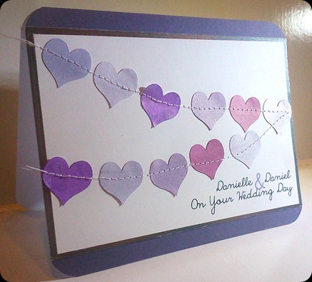
Apologies for the fairly awful photo – it was very late and I was very tired by the time I finished this card! – but here is my take on a fantastic Laura Bassen creation:
DanielleDaniel
Yeah… mine ain’t a patch on hers but the client liked it so…

Thursday, September 12, 2013

Thank You

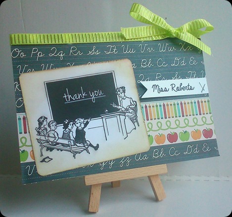
This is the partner to the other teacher thank you card I made:
MissRoberts
I kept a similar layout but I didn't want it to be the same so I found this lovely vintage image from The Graphics Fairy. There was a sum written on the blackboard but I replaced it with the words thank you, printed it out, rounded the corners and added a touch of distress ink to the edges.

Wednesday, September 11, 2013

Thinkin’ Outside The Blue Box

TardisVortex
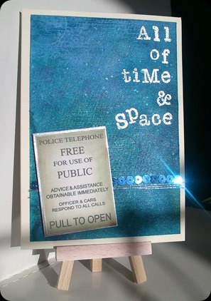
Sorry about the shadow on this pic, I was trying to make the most of the morning sunshine and that's the shadow of my bed frame! I got a pretty cool sparkle on those sequins tho, eh? You’d think I’d planned it!
For the 99% of people who have no idea, this element is the poster that appears on the door of the TARDIS in Doctor Who. I made the ‘vortex’ background myself using lots of water, watercolour paper, a lot more water and a couple of different shades of Dylusions ink…
…AND I LOVE IT!
Its my most successful inky business to date and I almost didn't want to part with it. I have the other half on my desk daring me to cover it up… I don’t think I can!

Wednesday, July 31, 2013

Sunshine Of Your Love

HelloSunshine

I. Love. This. Card!

I had something like this is my head when I saw Christina’s card and was galvanised into action! I blended my trusty old Dylusions onto tissue paper - to see what would happen mainly and I liked it! I cut the Simon Says Stamp sunburst directly out of the card front and mounted the tissue panel behind it.  The sentiment is spelt out with alphabet stamps from Ali Edwards/Technique Tuesday and Kasiercraft.

And I really wasn't sure about it til I added the birds (from SU’s Up, Up & Away) but that was just the perfect finishing touch!

Monday, July 29, 2013

Next Stop: Everywhere

NextStop

There is not much I can say about this one, you either get it or you don’t! I inked the background with a combination of Dylusions and Distress Inks then ran it thru the printer to print the Doctor/planet/TARDIS image… and it barely showed up! So I printed the main elements again onto white, fussy cut them and foam mounted them over the top of the first print. The paper already had a ‘notepaper’ edge to it so I went with a larger card base and mounted it like a scrap of paper. The sentiment is a quote by River Song (I think).

p.s. the image came from Pinterest, if its yours please let me know so I credit you!

Sunday, July 14, 2013

Hey Hombre!

Loraine gave me a sample of embossed card after she’d been playing with her new Stampin’ Up embossing folder and I immediately thought of honeycombs and bees:

Honeycomb

I’ve had this honeycomb collection from Pink Petticoat for a while now so it was just crying out to be used on this project. I have a bit of a thing for creating fades/gradients in Photoshop (you should see the design work I do at work, I sometimes think an intervention is called for!) so it seemed kinda natural to print the pattern to this card front and fade it out to stop it detracting from the focal elements.

Maybe it was a fluke or maybe it was cos I’d read about the Daring Cardmakers challenge earlier that day and the thought had lodged in the back of my brain, who knows. I’d like to enter this for their Ombre challenge tho!

Pencils & Polka Dots

I was asked to make two teacher thank you cards for my bestie. I knew they had to be more towards the cute than the fashionable end of the scale, but I’ll admit I was struggling with ideas.

MissRiley

I decided to fall back onto my old favourite sketch, which required a pictorial element.. which got me thinking about flash cards – they’re educational, right? So I downloaded a set of digital images… and didn't like any of them! So I made my own! The background (digi) papers are from Jessica Sprague.com, a set called School Daze by Dani Mogstad. I like the pencil design so I managed to clip it out of one of the papers and turn it into a flash card style image. Pretty chuffed with the end result and so is the “client” so all’s good!

Sunday, June 30, 2013

A Gathering

Have you been following this years Paper Crafts Connection Gallery Idol? One of my favourite cardmakers made it to the top five with this beauty and as I follow her on Pinterest too, I told her how much I like the card and how hard I find that grouping of elements style of cardmaking… well of course I planted the seed didn't I? I had to give it another go – lets face it its not like I don’t have pots & boxes & packets of bits lying around my work space! Enough to meet the 10-items-on-a-card challenge a few hundred times over, I reckon!

GatheringBlue

This may well have been a fluke… we’ll have to see!

Sunday, June 23, 2013

Feather Light

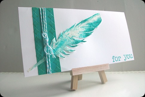
While trawling Pinterest for ideas I stumbled across Debby Hughes “Fabulousness” Board – and it really is full of fabulousness! I found this beauty by Gayatri Murali using the lovely Clearly Besotted Fancy Feathers set and decided to CASE it:

ShakeYour

I stamped the solid feather with Hero Arts Neon Inks and then overstamped with the detail feather in Memento Tuxedo Black. I foam mounted it to a card blank and attached the sentiment strip with a simple staple.

I also tried overstamping a little more accurately and I quite like this one too:

HopeItTickles

The sentiment on this is from a Waltzingmouse stamp set and I always wondered how I could use it! I might try this combination again, as it seems to fit!

If they will allow it, seeing as I copied from Gayatri, I’d like to enter this for the first Clearly Besotted challenge “Anything Goes”

Tuesday, June 18, 2013

Lost: One Summer

I saw this post on Shimelle’s blog today and instantly fell in love with the whole project. I’m not a scrapbooker – nor much of a stamper, way too impatient! – but I do love getting inky fingers so I was inspired to produce this:

DSC_0076

This features donkeys old distress reinkers – barn door and mustard seed – a liberal application of water/water brushes and my brand new toy the Simon Says Stamp sunburst die which I have only cut once but the resulting die cut has been used a few times as a stencil.

I am also fairly impressed with the accidental raised effect I have achieved by adding too much water to not-such-good-quality card. Its not so easy to see on this photo but IRL its almost textured!

p.s. Don’t actually know who Ralph Waldo Emerson is but he had a right gob on him!
Monday, May 13, 2013

English Country Side

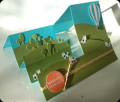
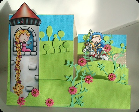
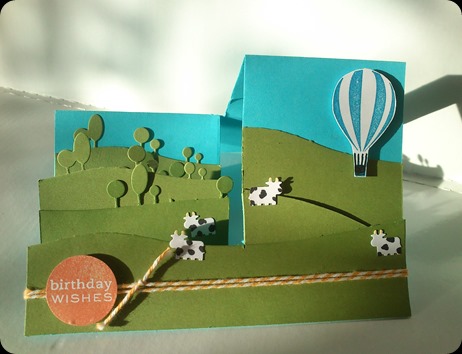
Following on from the success of the Rapunzel card, I had to try the stepper template again and I also wanted to utilise the landscape dies as more of a focal point so I folded another card from blue this time and cut a pile of rolling hills:
EnglishCountry_Front
Its unfortunate that the direct sunlight in this pic is showing up all the flaws where I have removed the odd tree from the sweeping hill – its not so obvious in real life, I promise!
It waited as just the green hills for about 24 hours while I mulled over how to finish the scene but a balloon from Up, Up & Away (SU) seemed appropriate and I have had this lil moo cow punch for ages and don’t think I’ve ever used them on a card! I added a sentiment and twine in orange to add a spot of colour.
Again, here is a side shot showing the steps more clearly:
EnglishCountry_Side

Monday, May 06, 2013

Fairytale Steps

RapunzelStepper_Front
It all started with this gorgeous card I spotted on Pinterest (right)
I’ve always been more of a papercrafter than anything else and I’m always up for trying out a bit of paper engineering so I was more than game to have another go at a side stepper card.

Lorraine at Cards & Co has a really good tutorial on her blog and she also tells you that these lovely digi stamps come from Pink Cat Studio (Lily & Billy) and I was immensely grateful that as part of the download you get a coloured version – my headache and unimpressive colouring skills were both very pleased!
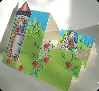
I was also very pleased to see that she had used the Memory Box landscape dies in her background too - I added a little SU Pear Pizazz ink to the edge of the other layers to help them stand out from the background layer – and I made my bushes with by cutting up a die cut from my new Memory Box Grand Oak die and adding tiny pink flowers (actually punched snowflakes double layered) with a yellow gem attempting to echo the flowers on Rapunzel’s tower.
Here is a side view showing the steps more clearly, I hope you like!
RapunzelStepper_Side

Friday, May 03, 2013

Picking Cherries

So I finally caved and joined an online card class – late as ever (is it still “late” when its always? Isn't it just Jody time by now?) cos I joined two days after it started but so far so good!

The class is called His & Hers and the basic concept is to inspire feminine and masculine versions of cards with a common link.

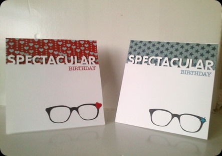
Spectacular

Neither of these cards bear much resemblance to any of the designs explored in the videos I have watched so far but I have cherry picked a number of elements that came together to form these beauties.

One thing discussed so far is how the design can become his or hers just by changing the colour scheme. I found these two papers in my leftovers and they coordinated perfectly with another tidbit I picked up – hearts for girls and stars for boys. This is by no means a hard and fast rule but again its a simple element to change about a design that can completely alter the feel.

Also earlier in the day I had seen this card by Debby Hughes, utilising a SSS die that is very popular and an “on the edge” technique that has enticed me for quite a while. I don’t own that die so Robocop got a dusting off and cut my choice of word, the specs, the star & the heart out.

The white panel is foam mounted and the specs and element are simply glued down. The BIRTHDAY is from The Crafts Meow Typically Teen stamp set – I chopped the HAPPY off and stamped it in SU Real Red & Pacific Point then daubed the mini elements with the same ink.

If any fellow students are reading this and are wondering; I made a conscious decision to keep the same font, and the same shaped frames – although I did toy with Dame Edna style frames for a little while! – and to use black on the frames. I guess I wanted to change the minimum amount of elements to prove (or disprove) the theory – do you think I did?

Thursday, May 02, 2013

March Days


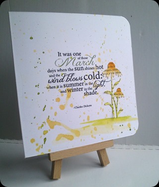
MarchDay
 
“It was one of those March days when the sun shines hot and the wind blows cold: when it is summer in the light and winter in the shade”
 
I have always found Charles Dickens to be a dreary author and I hated studying Great Expectations at school but this quote is an example of hitting the nail on the head (and probably why every one else thinks he’s great!).
 
 It didn't really require much embellishment as the artist had already laid the words out well, but I’m enjoying this paint splodging thing so I decided to flick a bit of Dylusions around. I also added a die cut flower which I touched up with a bit of the left over ink and a water brush, pretty & simple!

Tuesday, April 30, 2013

Feather light

This is one of those “get off with ya” moments…

I read – just over a year ago, it seems – about the wonderful Betsy Veldman stamping this card with an actual feather:
BetsyVeldmanStampedFeather Are you thinking what I thought? No way, right? How could you possibly get such a crisp image without a stamp?

But the idea has been floating around my head ever since and while in the garden a couple of weeks ago – yes! I do know where it is! – I found a feather on the floor and it brought it all to mind again.

Now, I knew I would never be able to get enough pressure with just my fair hands but I thought about coating it with ink and running it through the Big Shot and lo:

Feather Print

Heavens-to-Betsy! I made a kitchen towel/feather/ink/paper combination and this is actually cut from the kitchen towel; somehow I got a better impression on this than the paper, but I now have four of these beauties to work with – I just cant believe it worked!

Saturday, April 27, 2013

Man Of Iron

Iron Man
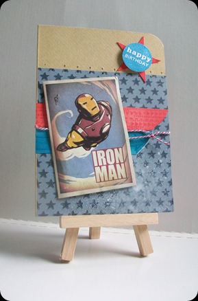
Today I created a subfolder of images called ‘Brands’ as I get so many requests for TV or Film themed cards! I have no problem browsing Pinterest for images tho, especially with the recent popularity of Marvel etc films, there are some really talented artists out there; its just a shame I can’t give them the credit they deserve!
This started out as a sketch but I got as far as sticking the backing paper down and decided I didn't like it so I rotated the design 90 degrees and settled on the old faithful “image-on-a-slant”.. Hey, it works for me!

Monday, April 22, 2013

Colour Clouds

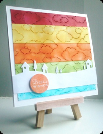
One of my more recent purchases is the two ‘skyline’ dies from Memory Box – and apparently I wasn’t exactly quiet about liking them even before I owned a manual die cutter…*shucks!* – so when I spotted this beauty I thought I’d have a go myself:
ha-collab
This is from one of A Blog Named Hero’s celebration posts and is by a crafter called Christine Drogt – who I now realise I know the work of but had not registered her name, sorry Christine! I recommend you go and have a look at her blog cos this girl has style!
Anyway, I wanted to recreate her card so I used Stampin’ Up’s embossing folder “Cloudy Day” and embossed a panel measured to fit my card front (twice cos of the size of the folder). Then I cut the panel into strips and got out the old trusty daubers, along with Real Red, Daffodil Delight, Pumpkin Pie, Pear Pizazz & Tempting Turquoise SU inks. I think you can work the rest of the construction process out for yourselves:
DSC_0134
Awful photo, I’m losing the light, but I’m pleased with the card itself.. just gotta stop singing the Rainbow theme tune now…

Saturday, April 20, 2013

There’s No Such Thing As A Gruffalo…

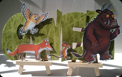
The same little boy that I made this card for will also be getting a Gruffalo troupe on his big day today (many happy returns Owen)

GruffaloOwen

I actually printed these letters out and cut them out by hand, rather than coaxing Robocop to life… and I’m glad I had the last minute thought of stencilling the trees in the background, I think it just livens it up a bit.

Silly bloggers, there's no such thing as a Gruffalo!

Wednesday, April 17, 2013

Hibiscus Are Go!


StencilFlower
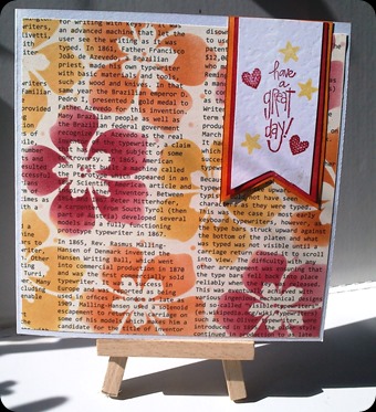
One of my many – but not that many! – purchases from the NEC back in March was this stencil from Imagination Crafts. Its been hanging on my.. thing looking at me since then – the demo I saw involved glitter on a sheet of acetate n that kind of thing takes time and clearing up so I haven’t tried it just yet – but I’ve completed a couple of projects with this Stampin’ Up text paper so it was out on desk and I thought I’d give the stencil a whirl. The inks are Stampin’ Up too, Real Red, Daffodil Delight and Pumpkin Pie and I used the daubers to apply the stencil and then the same inks and daubers to colour the layers of the sentiment. Not the most adventurous of cards but nice enough, right?

Sunday, April 14, 2013

Incredible Eye Shadow

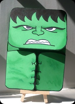
Who knew The Incredible Hulk wore eye shadow?
HulkOutside
Well, I suppose technically its just shadow…
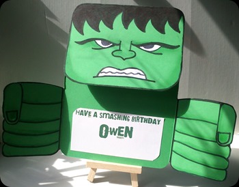
Really quite chuffed with this hit of inspiration – I’ve already made one Hulk card this year and I was struggling with the concept but then this lil beauty sprang to mind. I think I have the lovely Loraine to thank actually, as we made an easel card in class a few hours before and I sort of had construction and *ahem* flaps on my mind…
HulkInside

Plus I've had these freebie vivid green gatefold cards for years! Sorted!

Wednesday, March 06, 2013

Even Superheroes Need To Tell The Time!

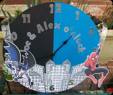
Back in 2011, I decorated a clock for the son of my best friend to the theme of his then newly decorated bedroom. Well, since then his room has acquired another occupant in the shape of his lil brother and both of them have acquired a penchant for Super Heroes, so here is this years commission:
100_2609
The base is another cheap clock from B&M – and I have learned from last time that removing the hands wasn’t helpful to the mechanics so I tried to design this one around the hands. I had been asked for it to reflect the two favourite characters so I decided to ‘split’ the sky, a dark tone for Batman and a lighter sky for Spiderman, with splatters of silver spray ink to mimic stars and hopefully tie the two together.
I was concerned about adding any kind of 3D element that would potentially interfere with the hands so I came up with the idea of adding the characters on acetate…for want of a better word ‘springs’:
100_2610
100_2611
So they sort of look as if they are flying/swinging high above the city skyline and they move in any available breeze – just got to work out a way to wrap it now!

Thursday, January 31, 2013

WOYWW 191: Hercules Would Be Proud!

Rather late to the party today but I just wanted to share with you the results of my latest herculean task. If you have ever wondered, this is what 90 wedding invitations look like:

DSC_0105

Thankfully these evening ones were easier than the day ones but I was very glad to say “finished!”

Happy WOYWW, peeps. Use the link on the side bar to visit our lovely leader Julia.